A Worthwhile Purpose.
After we’d finished Reshma Thakkar’s personal website, and learned about her Made with a Purpose project, we knew that we had to help her create a worthy digital platform; one that would accurately reflect the beauty and prosperity constructed by the philanthropic business.
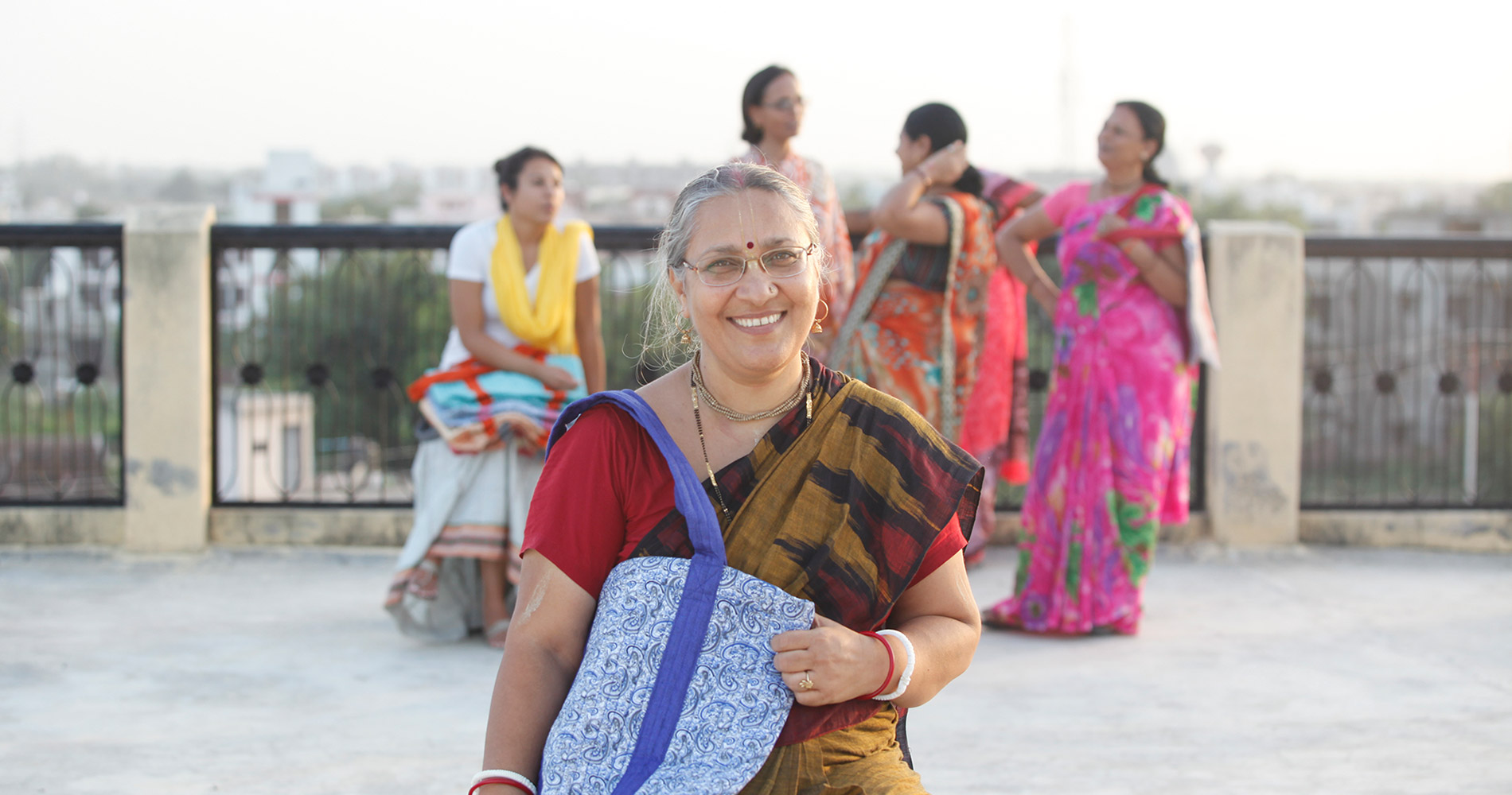
To give the team a more personal look at the project, Reshma invited us to Vrindavan, after her website’s photoshoot, to meet the women and see Made with a Purpose in real time, fulfilling its purpose.
She wanted us to be inspired by what we saw, heard, and felt around these women. She wanted us to know what we are showing to the world.
We did see it. And we were inspired. Keep reading to see how we honored what we saw with the website design.

From the Sewing Machine to the Digital Market
Made with a Purpose exports handmade bags, totes, and other cloth items made from vintage saris. They are sewn and stitched by rural women in the city of Vrindavan.
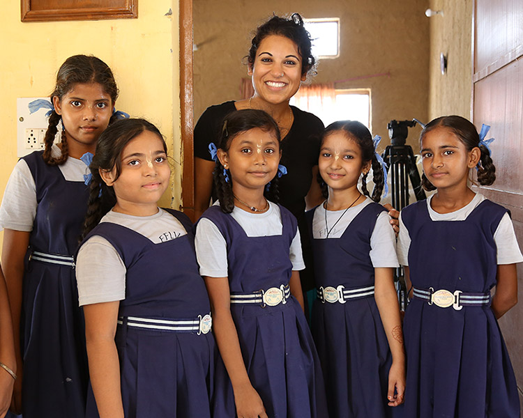
The project supports these women with a job. This financial independence allows them to then support themselves and their family. The company also invests some revenue into sponsoring the education of girls in Vrindavan and other rural areas.
Given that the project sustains and provides life and beauty, we wanted the theme to exude and sprout with life. Leaf green and white naturally became the two primary colors of the theme.
Designing a Life Giving Logo
We had two goals with the logo. One, keep it culturally accurate. For this, we connected the letters and words in the logo with a straight over-hanging bar (called shirorekha), as Devanagari does, the script Hindi is written in.
Our second goal – make it beautiful. We hide the words “with a” by using a small font and light color, leaving “Made” and “Purpose” the focus in big fonts with two contrasting tints of green. The crown, so to speak, a minimalist lotus flower to the right.
Simple, elegant, and relevant.
A Brand of Humanity
People want things and services. If you can give it to them for the price they want and the quality they desire, they will buy it. Altruism also helps spread awareness, adding a philanthropic layer to the more material (but always necessary) business identity. Made with a Purpose has both.
But it also has character. We needed to show that.
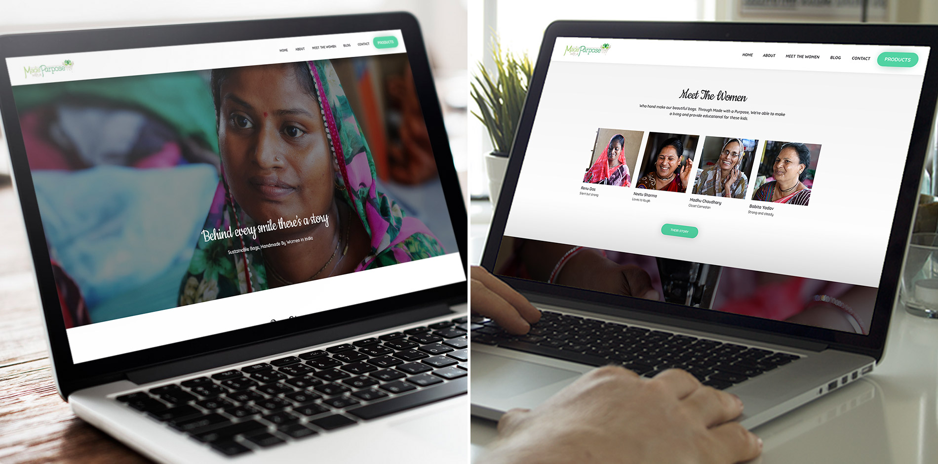
In the About Page on the website, we don’t just give an overview of what the business is, what it sells, and what it accomplishes through sales; we give a story. A story that people remember and will invest time, money, and emotions into.
For this, we write a personalized account of the women working for Reshma and helped by the philanthropic efforts of Made with a Purpose. People can see and feel the struggles of these women, so that they may truly understand the organization they are helping.

Blog Marketing
Blogging, if done right, provides valuable information and draws traffic. We aim to do both. The blog tells uplifting stories and gives advice on how to make changes in their own community. Additionally, it attracts traffic for more customers and more supporters of the Made with a Purpose cause.
Designing Done Right
Design, at its elementary level, comes down to words and pictures and how they’re laid out. If the pictures are beautiful, the words are engaging, and the layout is simple and visitors can navigate without problem, they stay.
Large, high-resolution pictures inserted in a crisp white background, laced by concise and clear text with a vine-like font, coagulating with the website’s theme of life.
Then, we introduce the story element on the first page, with pictures of the women that Made with a Purpose is helping.
A website full of life, with a very low bounce rate, and a blog page constantly whipping up SEO rankings.

Constructing Conversions
But, as with all businesses, it comes down to one thing: will people buy the product? It’s what supports the charitable efforts and the lives of the women working.
To lead visitors to the product page, we put it at the end, so as not to be too pushy, but then surround it with a green bubble, a unique feature in the menu, contrasting and drawing attention.
The site does what it’s meant to do: attract visitors, educate them, inspire them, and lead them to the products.
Want us to give you an image makeover like this? Or, if you’re new, create an image for you?
Let us help you get others to wear, read, and live your brand,
whatever it is. The world needs your gift.


